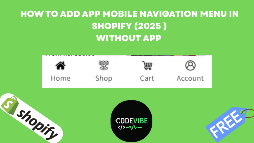
When it comes to mobile shopping, user experience (UX) is everything. If your Shopify store looks and feels like a mobile app, customers are more likely to stay longer, explore more, and purchase faster. One of the most effective ways to achieve this app-like design is by adding a custom mobile bottom navigation menu in your Shopify store.
In this article, we’ll show you step by step how to create an app-style bottom menu (Home, Shop, Cart, Account) inside Shopify without using any paid apps.
Why Add a Mobile Bottom Menu in Shopify?
- App-like design: Makes your Shopify store feel like a mobile application.
- Easy navigation: Customers can quickly access Home, Shop, Cart, and Account.
- Better UX: Improves the mobile shopping experience and reduces drop-offs.
- Free customization: You can do it with simple code—no extra cost.
Step 1: Open Shopify Theme Code Editor
- Log in to your Shopify Admin Dashboard.
- Go to Online Store → Themes.
- Click on the three dots (…) → Edit Code.
- This will open the Shopify Theme Code Editor.
🔧 Step 2: Create a New Section
- Inside the code editor, locate the Sections folder.
- Click Add a new file.
- Name it:app-menu.liquid
- Paste the custom bottom menu code (you can get it from the free link in the video/article description).
{%- if section.blocks.size > 0 -%}
<nav class=”mobile-bottom-nav” role=”navigation” aria-label=”Mobile bottom navigation”>
<ul class=”mobile-bottom-nav__list”>
{%- for block in section.blocks -%}
{%- assign block_icon = block.settings.icon -%}
{%- assign block_link = block.settings.link -%}
{%- assign block_title = block.settings.title -%}
<li class=”mobile-bottom-nav__item” {{ block.shopify_attributes }}>
<a href=”{{ block_link }}” class=”mobile-bottom-nav__link” aria-label=”{{ block_title | escape }}”>
{%- if block_icon -%}
<img src=”{{ block_icon | image_url: width: 24 }}” alt=”{{ block_title | escape }}” class=”mobile-bottom-nav__icon” loading=”lazy” width=”24″ height=”24″>
{%- else -%}
<span class=”mobile-bottom-nav__icon-placeholder”>{{ block_title | slice: 0, 1 | upcase }}</span>
{%- endif -%}
{%- if block.settings.show_label -%}
<span class=”mobile-bottom-nav__label”>{{ block_title }}</span>
{%- endif -%}
</a>
</li>
{%- endfor -%}
</ul>
</nav>
<style>
.mobile-bottom-nav {
position: fixed;
bottom: 0;
left: 0;
right: 0;
padding-bottom: env(safe-area-inset-bottom);
z-index: 1000;
background-color: {{ section.settings.bg_color | default: ‘#ffffff’ }};
border-top: 1px solid {{ section.settings.border_color | default: ‘#e0e0e0’ }};
display: flex;
justify-content: center;
padding: 0.5rem 0;
box-shadow: 0 -2px 10px rgba(0, 0, 0, 0.1);
}
.mobile-bottom-nav__list {
display: flex;
list-style: none;
margin: 0;
padding: 0;
width: 100%;
max-width: 480px;
justify-content: space-around;
}
.mobile-bottom-nav__item {
flex: 1;
text-align: center;
}
.mobile-bottom-nav__link {
display: flex;
flex-direction: column;
align-items: center;
padding: 0.5rem;
color: {{ section.settings.text_color | default: ‘#333333’ }};
text-decoration: none;
transition: color 0.2s ease;
}
.mobile-bottom-nav__link:hover,
.mobile-bottom-nav__link:focus {
color: {{ section.settings.active_color | default: ‘#007bff’ }};
}
.mobile-bottom-nav__icon,
.mobile-bottom-nav__icon-placeholder {
display: block;
width: 24px;
height: 24px;
margin-bottom: 0.25rem;
font-size: 0.875rem;
line-height: 1;
{% comment %} background-color: {{ section.settings.text_color | default: ‘#333333’ }}; {% endcomment %}
{% comment %} color: #fff; {% endcomment %}
display: flex;
align-items: center;
justify-content: center;
}
.mobile-bottom-nav__label {
font-size: 0.75rem;
font-weight: 500;
}
/* Hide on desktop */
@media (min-width: 768px) {
.mobile-bottom-nav {
display: none;
}
}
/* Ensure body has padding-bottom on mobile to avoid overlap */
@media (max-width: 767px) {
body {
padding-bottom: 80px; /* Adjust based on your nav height */
}
}
</style>
{%- endif -%}
{% schema %}
{
“name”: “Mobile Bottom Navigation”,
“tag”: “section”,
“class”: “section-mobile-bottom-nav”,
“settings”: [
{
“type”: “color”,
“id”: “bg_color”,
“label”: “Background Color”,
“default”: “#ffffff”
},
{
“type”: “color”,
“id”: “text_color”,
“label”: “Text/Icon Color”,
“default”: “#333333”
},
{
“type”: “color”,
“id”: “active_color”,
“label”: “Active/Hover Color”,
“default”: “#007bff”
},
{
“type”: “color”,
“id”: “border_color”,
“label”: “Border Color”,
“default”: “#e0e0e0”
}
],
“blocks”: [
{
“type”: “menu_item”,
“name”: “Menu Item”,
“settings”: [
{
“type”: “image_picker”,
“id”: “icon”,
“label”: “Icon Image (24x24px recommended)”
},
{
“type”: “text”,
“id”: “title”,
“label”: “Label (for accessibility and optional display)”,
“default”: “Home”
},
{
“type”: “url”,
“id”: “link”,
“label”: “Link URL”
},
{
“type”: “checkbox”,
“id”: “show_label”,
“label”: “Show Label Below Icon”,
“default”: true
}
]
}
],
“presets”: [
{
“name”: “Mobile Bottom Navigation”,
“blocks”: [
{
“type”: “menu_item”,
“settings”: {
“icon”: “”,
“title”: “Home”,
“link”: “/”,
“show_label”: true
}
},
{
“type”: “menu_item”,
“settings”: {
“icon”: “”,
“title”: “Shop”,
“link”: “/collections/all”,
“show_label”: true
}
},
{
“type”: “menu_item”,
“settings”: {
“icon”: “”,
“title”: “Cart”,
“link”: “/cart”,
“show_label”: true
}
},
{
“type”: “menu_item”,
“settings”: {
“icon”: “”,
“title”: “Account”,
“link”: “/account”,
“show_label”: true
}
}
]
}
]
}
{% endschema %}
Save the file.
Step 3: Add Section to Footer
- Open Theme Customizer (Customize).
- Scroll to the Footer area.
- Click Add Section → Mobile Bottom Navigation.
- The section will now appear across all pages.
Step 4: Customize Your Bottom Menu
In the Customizer, you can adjust:
- Background color & text color
- Active menu color
- Border color
- Menu icons (Home, Shop, Cart, Account, etc.)
- Titles & links (URLs for each menu)
Step 5: Preview on Mobile
- Switch your theme preview to mobile view.
- You will now see a bottom navigation bar like a real mobile app.
- Each icon is clickable and redirects customers instantly.
🎯 Benefits of Shopify Mobile Bottom Menu
- Makes your store look modern and professional
- Provides an app-like shopping experience without building an app
- Increases customer engagement & retention
- Enhances navigation speed, reducing friction at checkout


![How to Add Google Sign-In to Your Shopify Store in 2025 How to Add Google Sign-In (Continue with Google) on Shopify Store [2025 Guide]](https://codevibee.info/wp-content/uploads/2025/09/Google-sign-in-150x150.png)
